User Manual
Important Note:
Please read the Privacy Policy carefully before using the application.
Open the app:
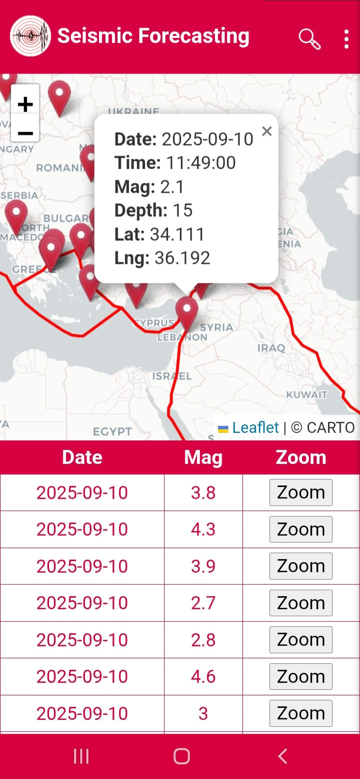
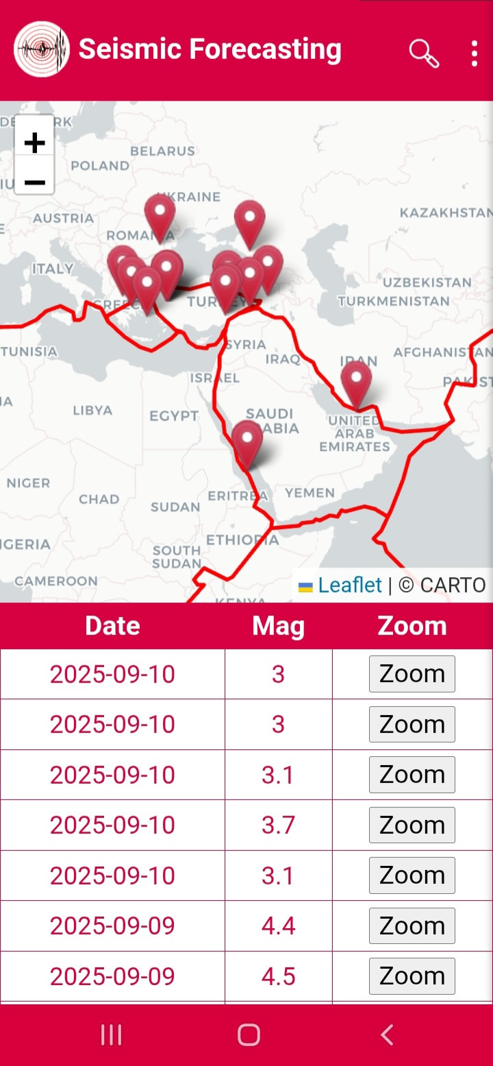
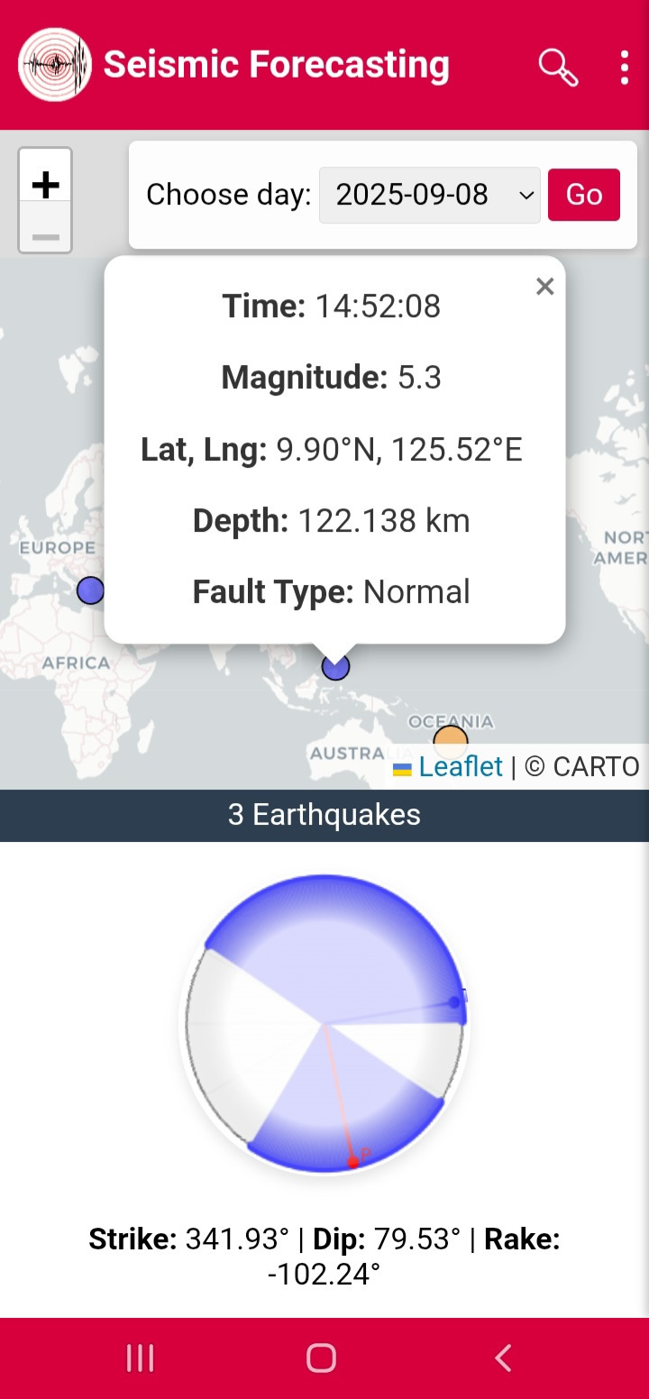
When the application is opened, the CARTO map appears, displaying the earthquakes that occur on a daily basis, along with a table showing the date and Magnitude of each earthquake, as well as a Zoom button (Figure 1). You can access detailed information by clicking the Zoom button or selecting the pin (Figure 2).
Figure1
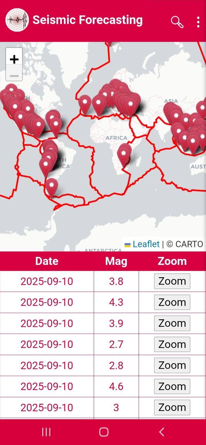
Figure2
Searching for Earthquakes:
When you click Search (Figure 3), you can filter by date range, magnitude range, latitude and longitude (Figure 4). Pressing Search displays the matching events (Figure 5).
Figure3
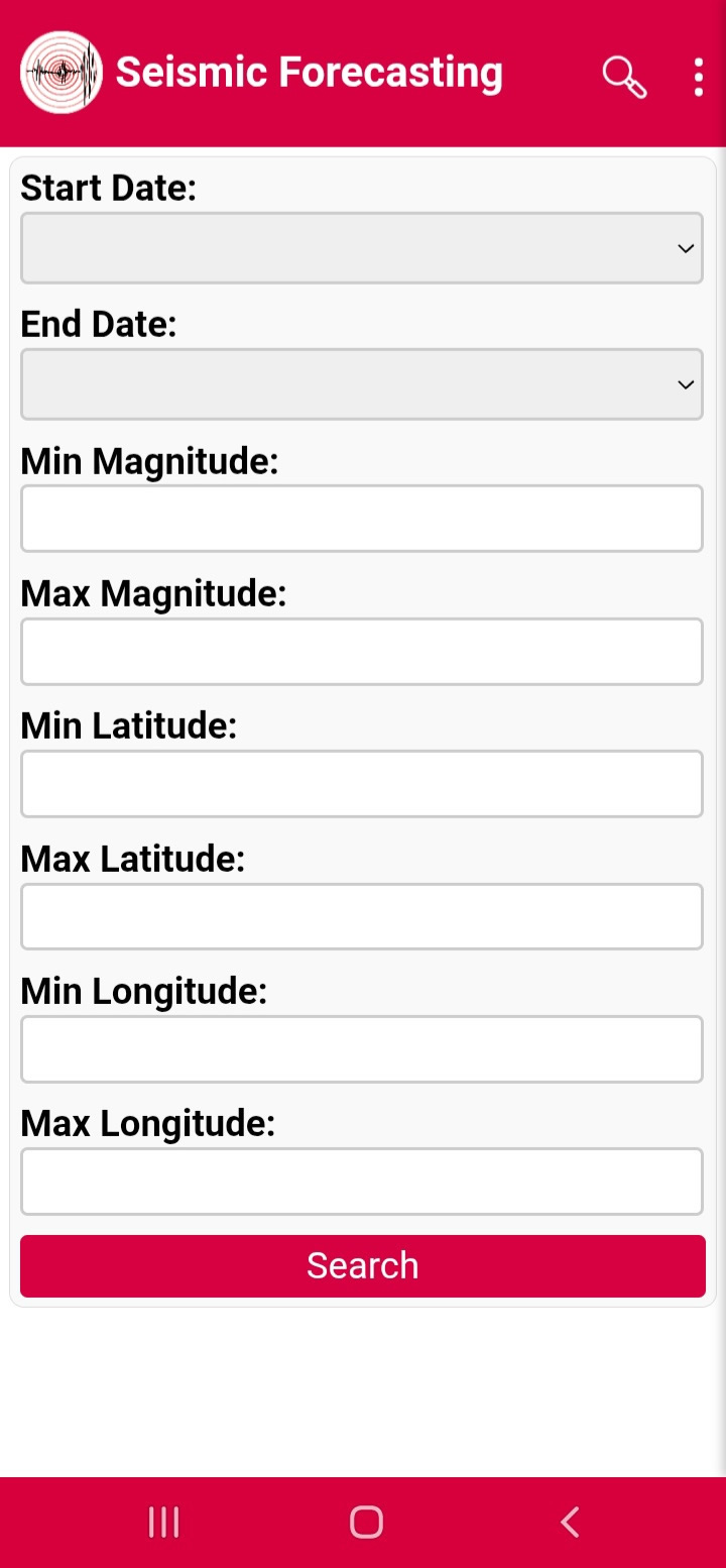
Figure4
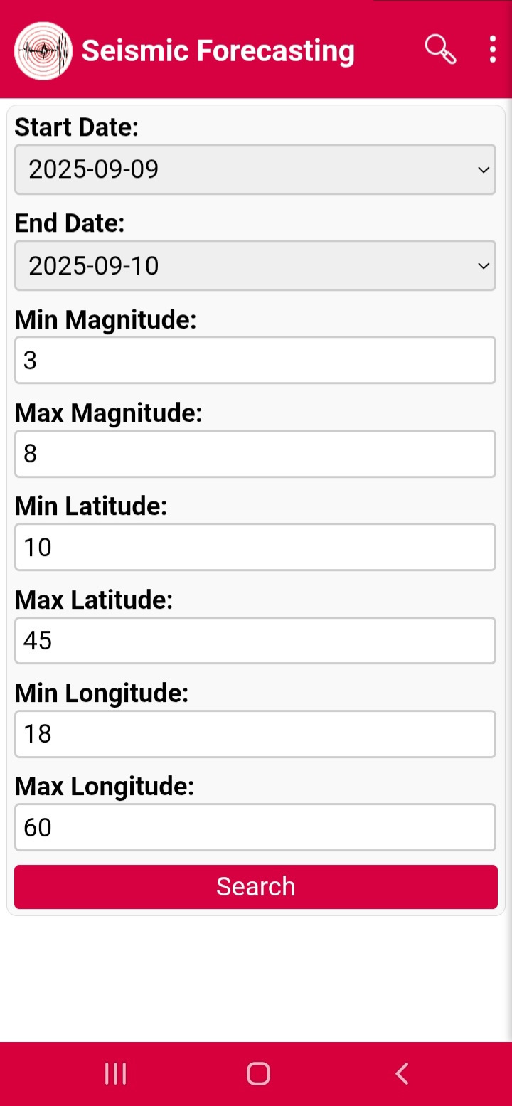
Figure5
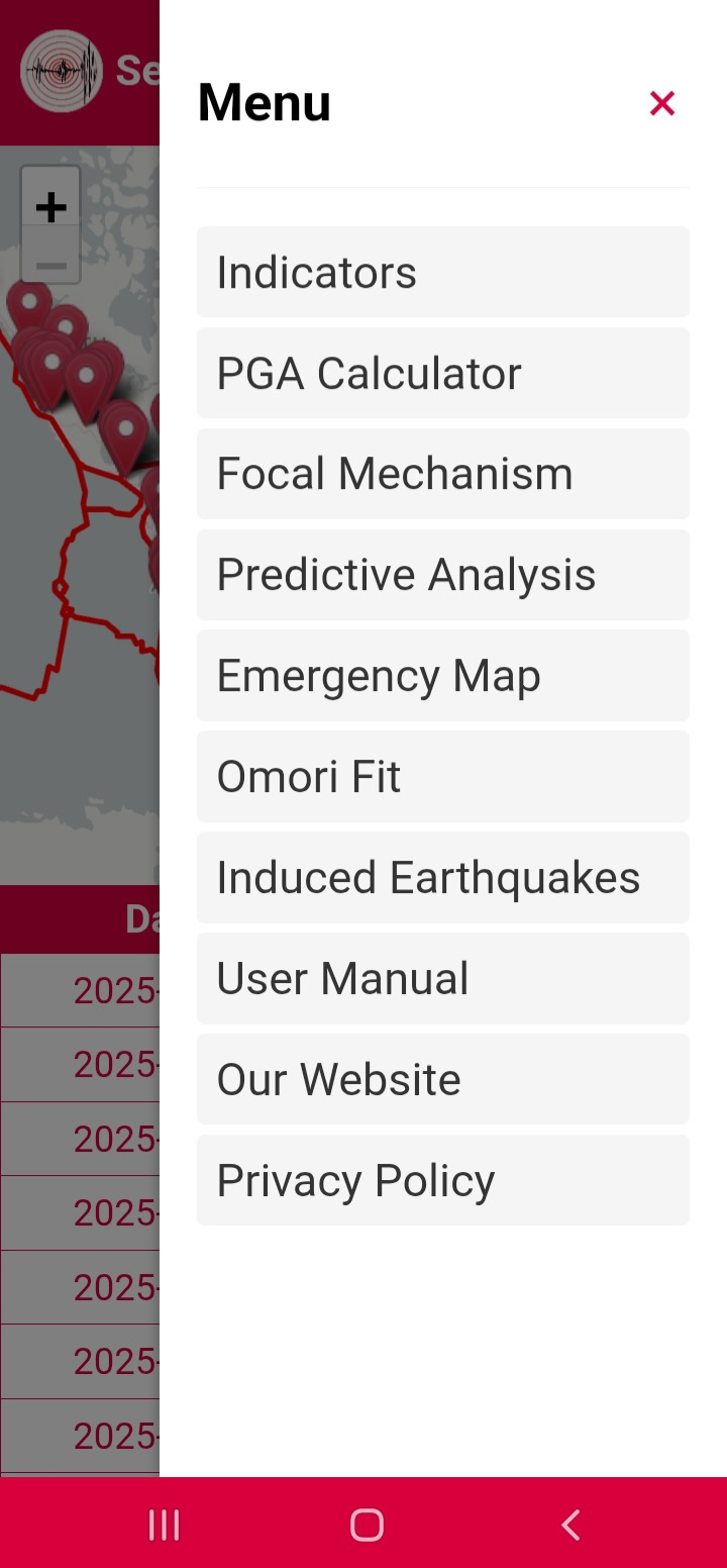
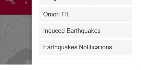
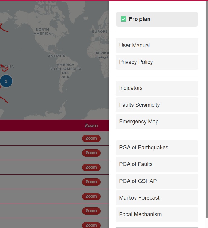
Menu:
Clicking the three dots opens the menu (Figure 6) including Pricing, User Manual, Privacy Policy, Indicators, Faults seismicity, Emergency Map, PGA tools, Markov, Focal Mechanism, Omori Fit, Induced Earthquakes and Notifications.
Figure6
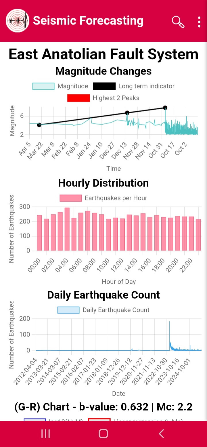
Indicators:
Selecting Indicators opens fault system polygons (Figures 7–8) and seven statistical charts including magnitude variation, hourly distribution, Gutenberg–Richter plots, b-value, z-value and completeness magnitude (Figures 9–13).
Figure7
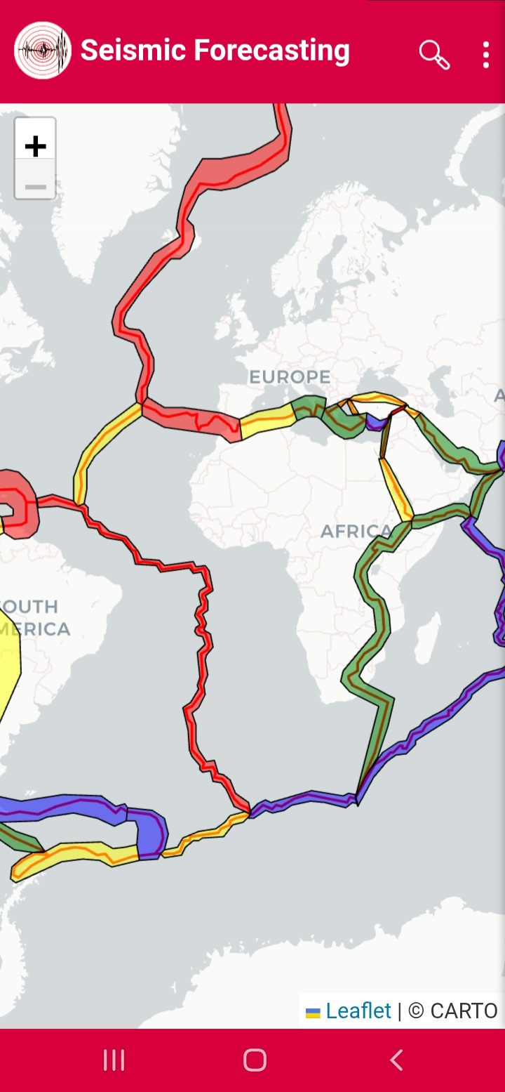
Figure8
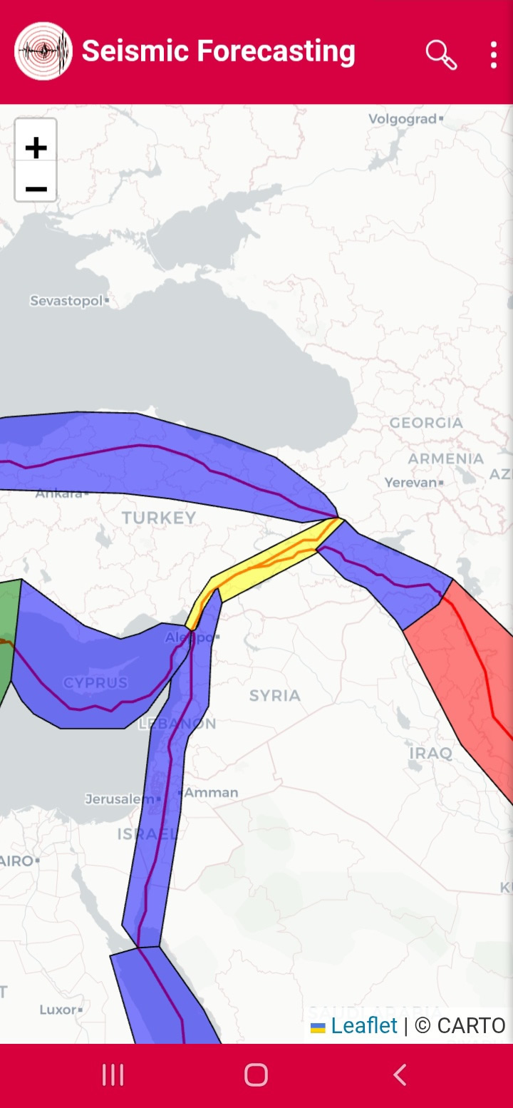
Figure9
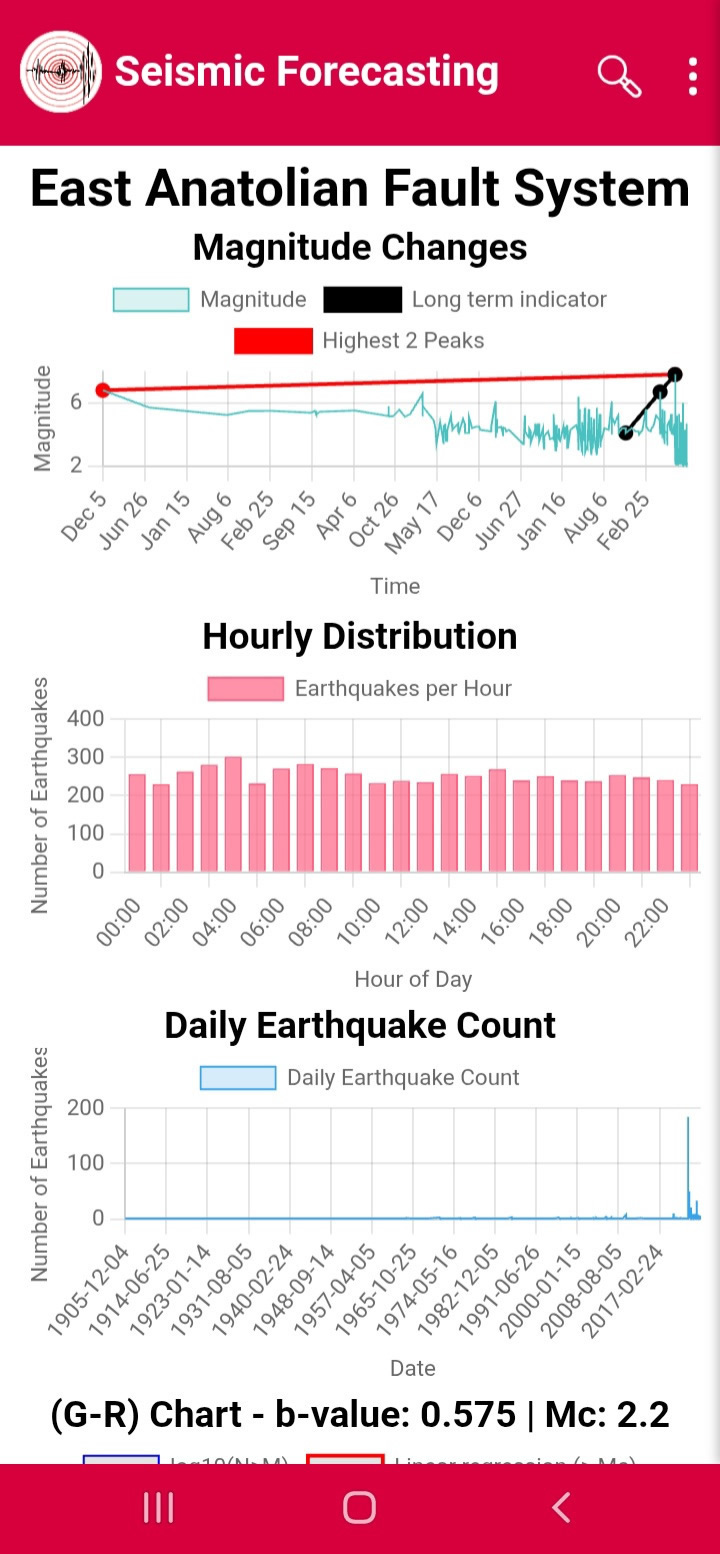
Figure10

Figure11
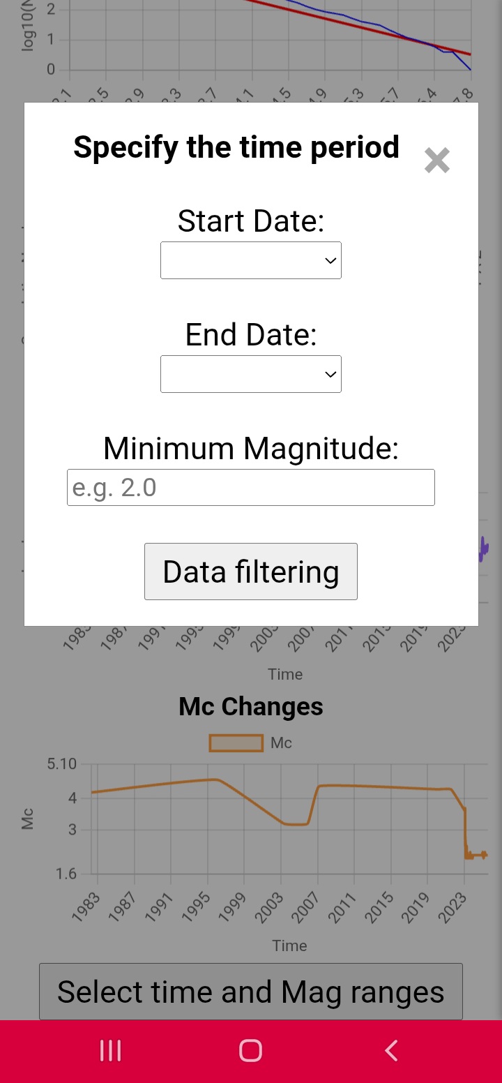
Figure12
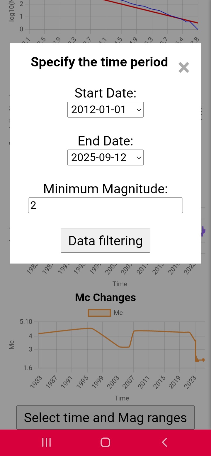
Figure13
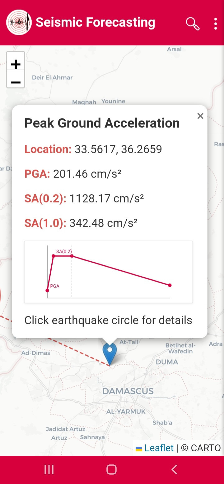
PGA Calculator:
Clicking PGA Calculator allows PGA and spectral acceleration computation (Figures 14–15).
Figure14
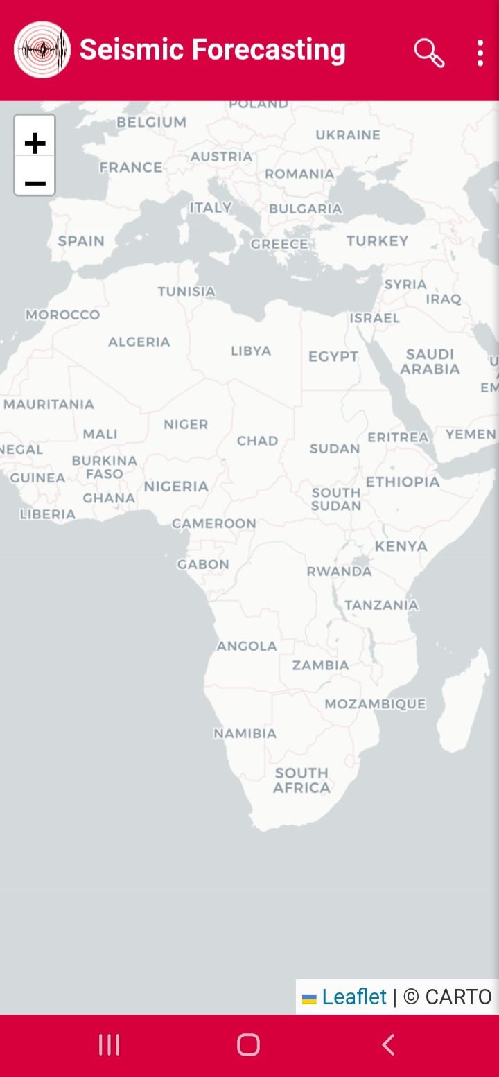
Figure15
Focal Mechanism:
Focal Mechanism displays beach balls and fault parameters (Figures 16–18).
Figure16
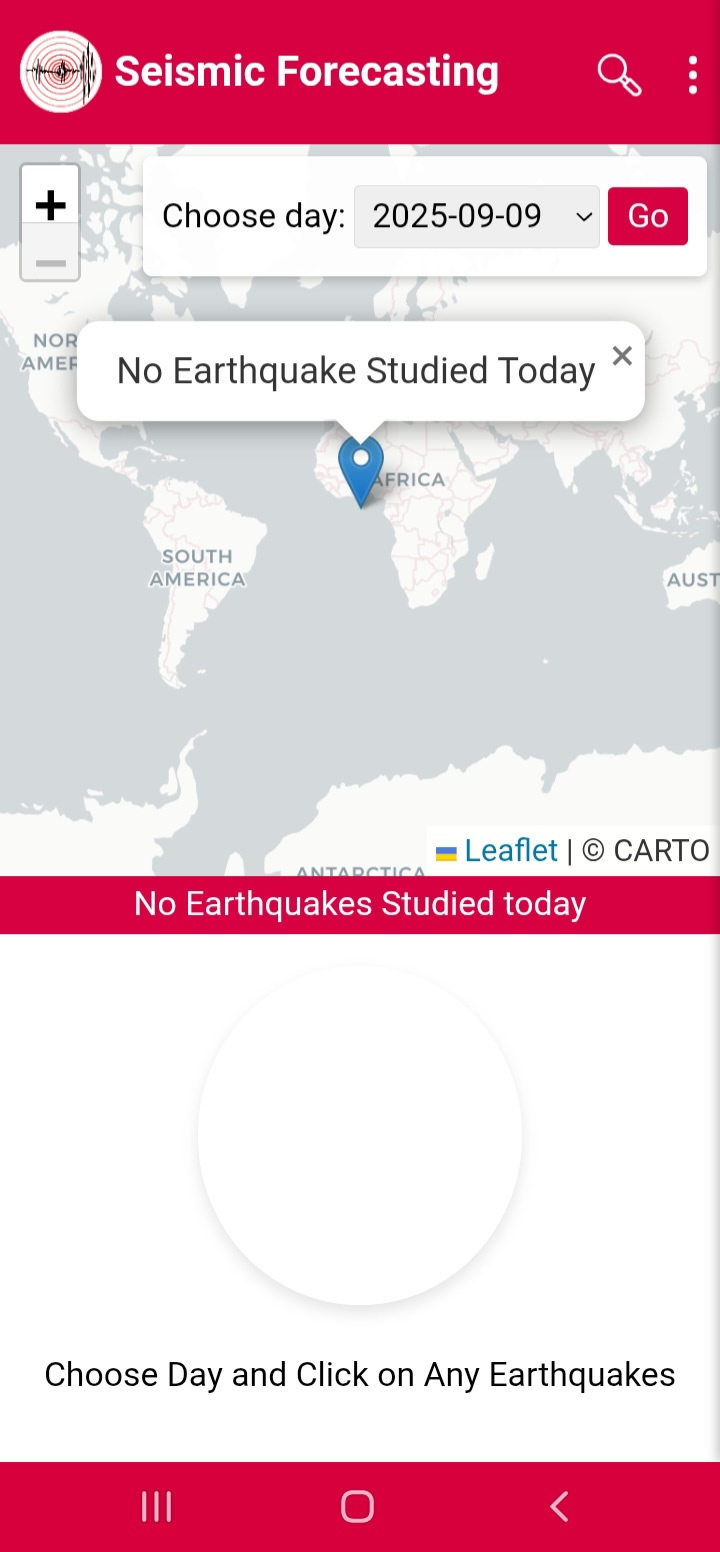
Figure17
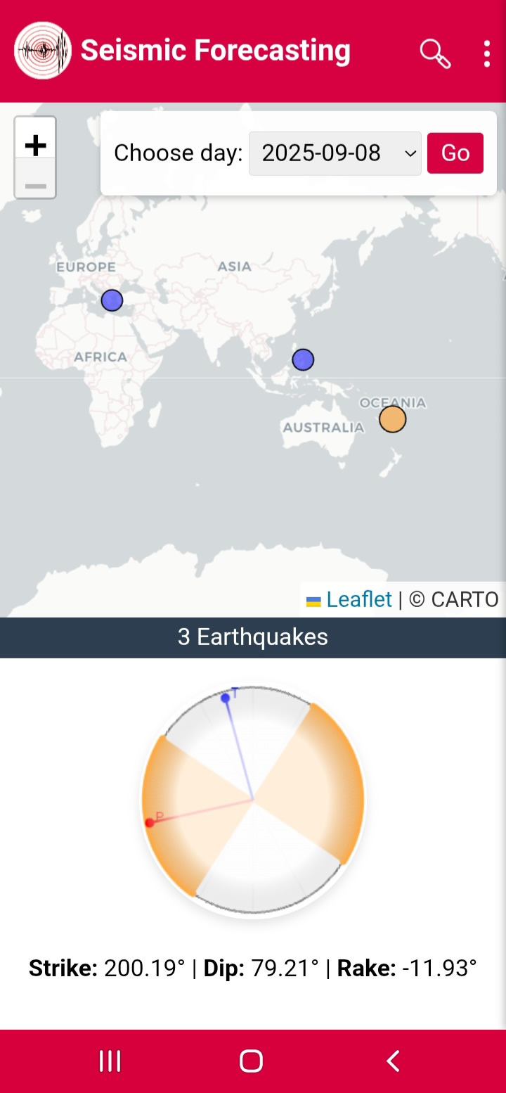
Figure18
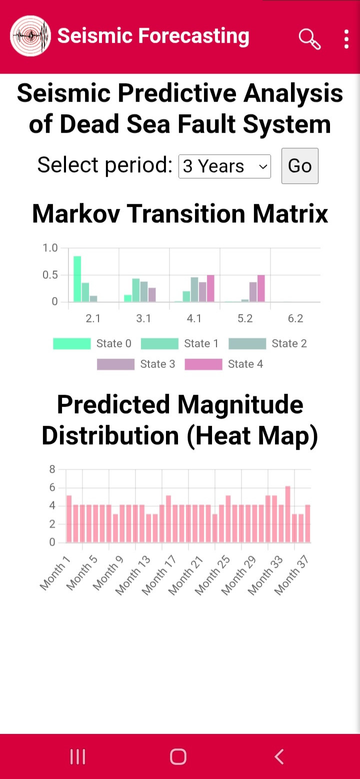
Predictive Analysis: Markov
Markov models estimate expected magnitudes for selected periods (Figures 19–22).
Figure19
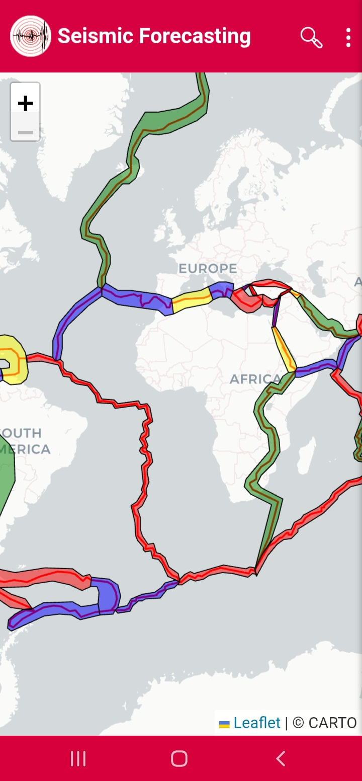
Figure20
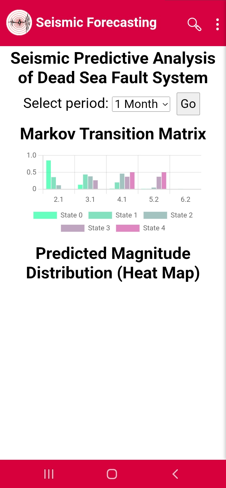
Figure21
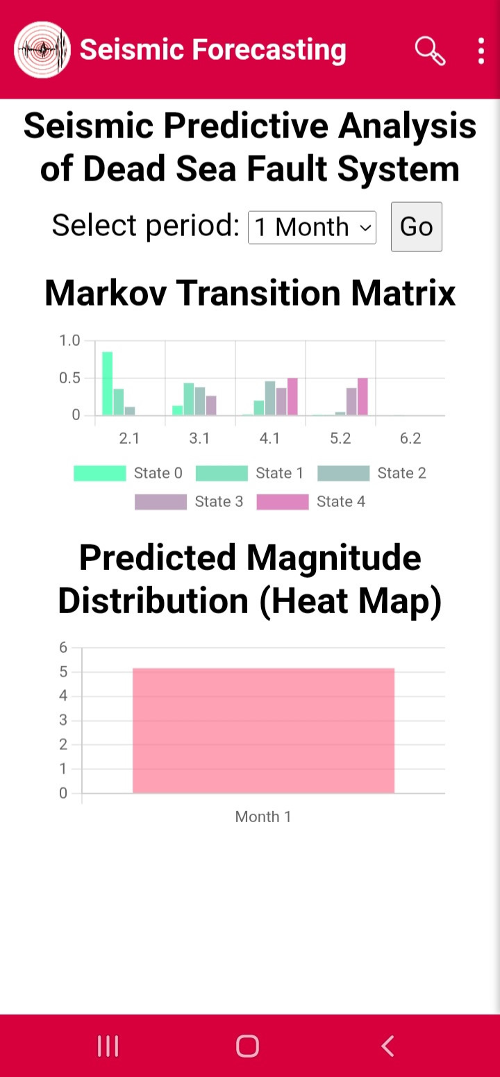
Figure22
Emergency Map:
Emergency Map shows hazard levels by color (Figures 23–24).
Figure23
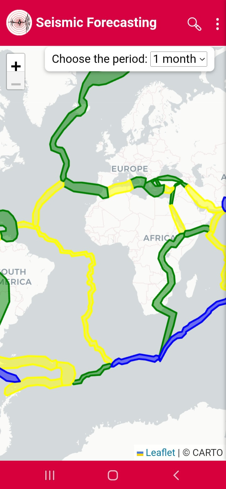
Figure24

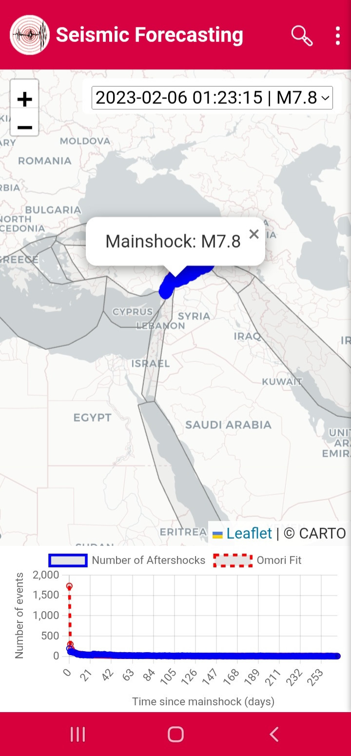
Omori Fit:
Omori Fit analyzes aftershock decay (Figures 25–26).
Figure25
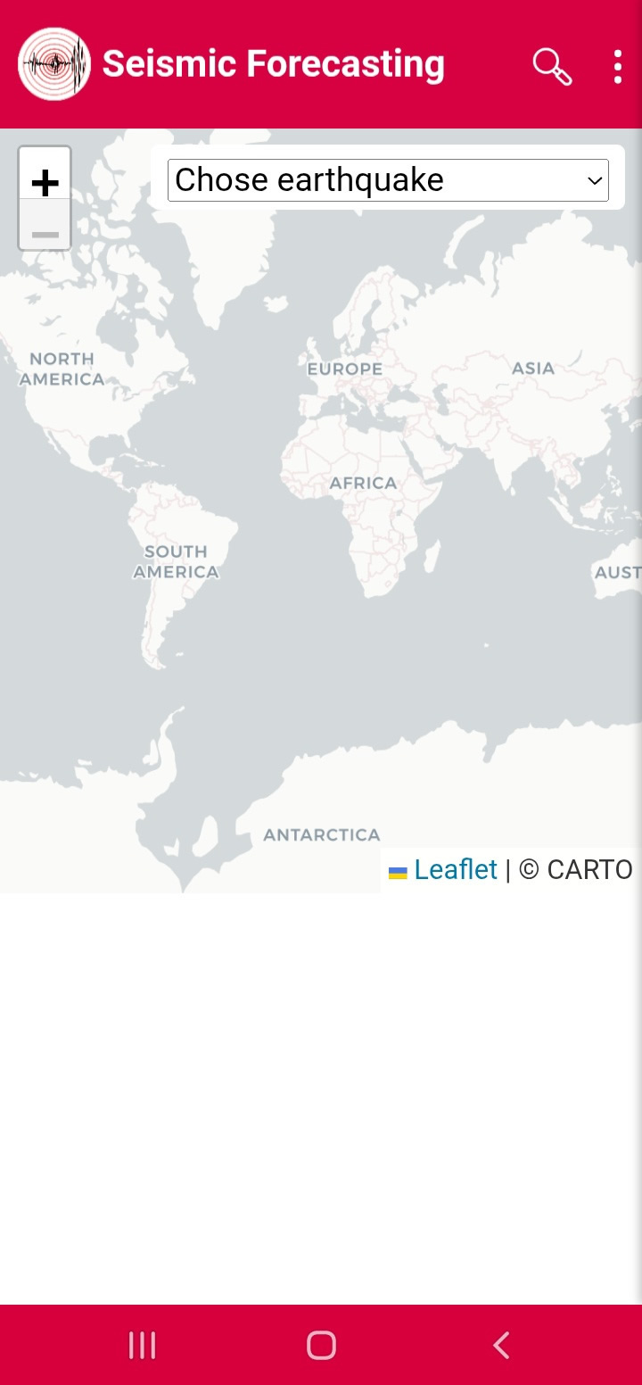
Figure26
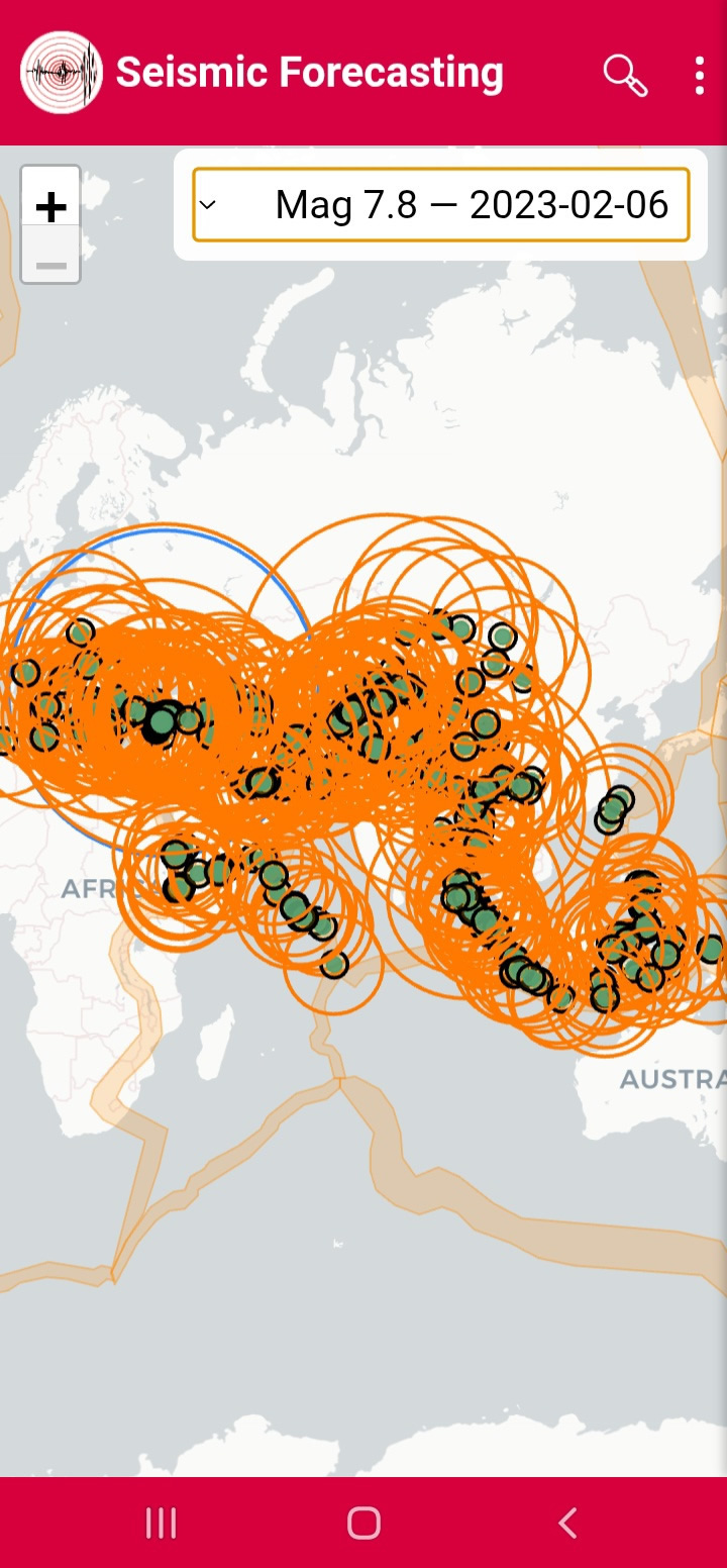
Induced Earthquake:
Induced Earthquake displays impact zones after major events (Figures 27–28).
Figure27
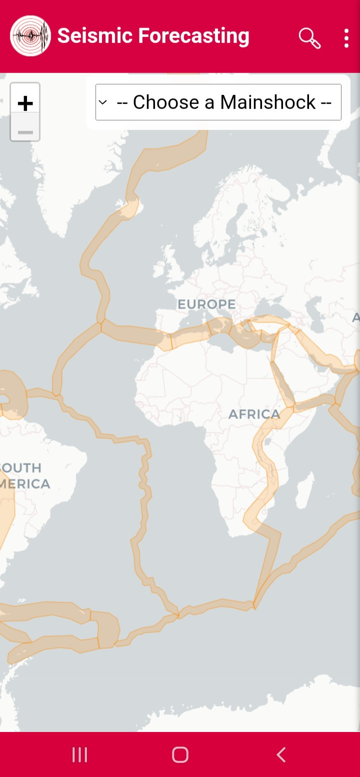
Figure28